"Data visualization" is the representation of information in the form of graphs, charts, or other images. Representing data in the form of some kind of picture often makes it easier to recognize patterns or determine meaning.
Below you'll see definitions of a few common kinds of graphs, a video tutorial on how to create data visualization in Microsoft Excel, links to some online data visualization tools, and some books on data visualization that we have here at the library.
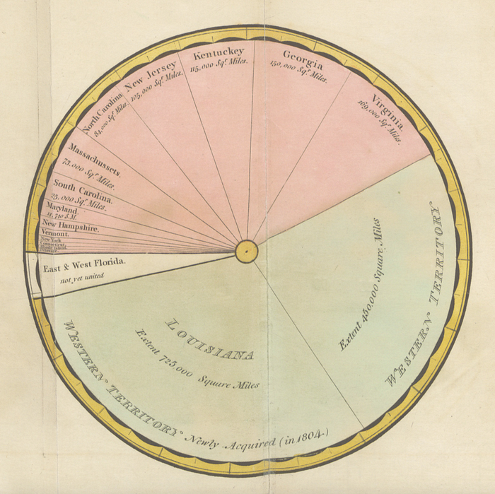
A pie chart is a circular graphic that is divided into slices to illustrate a proportion of a whole.
The Engineer William Playfair is credited with inventing the pie chart. This image comes from his Statistical Representation of the United States of America (1805). It shows a breakdown of the square mileage of the United States at the time:
In modern times, we can use pie charts to represent percentages of all sorts of things:
And they can also be useful for a joke:

Yi, Mike. “A Complete Guide to Pie Charts.” Chartio, https://chartio.com/learn/charts/pie-chart-complete-guide/. Accessed 31 Jan. 2024.
A line chart displays data points connected by a line. It's a useful kind of visualization to show trends over time, with time typically being represented along the X axis and some kind of quantity being represented along the Y axis.
You'll often see line charts for weather forecasts:

You'll also often see them representing economic data:

Yi, Mike. “A Complete Guide to Line Charts.” Chartio, https://chartio.com/learn/charts/line-chart-complete-guide/. Accessed 31 Jan. 2024.
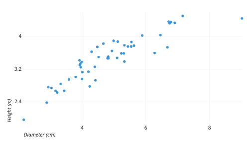
Scatter plots are used to observe the relationship between two variables. One variable is plotted on the X axis and another value is plotted on the Y axis. Each dot represents a single item that is being measured according to both variables.
For instance, here is a scatter plot representing measurements of a sample of trees. Each dot represents a single tree, with their heights being measured along the Y axis, and their diameters being measured along the X axis:
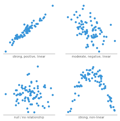
Scatter plots can show correlations that are positive (as one variable increases, the other increases), negative (as one variable increases, the other decreases), non-linear (at different points, an increase in one variable might mean an increase or a decrease in the other variable), or null (no relationship between the two variables):
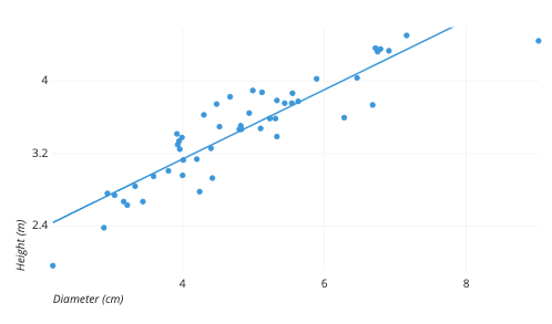
To help show correlations, a scatter plot can include a trendline:
Yi, Mike. “A Complete Guide to Scatter Plots.” Chartio, https://chartio.com/learn/charts/what-is-a-scatter-plot/. Accessed 31 Jan. 2024.
A bar chart (a.k.a. a bar graph or column chart) represents numerical measurements for a series of items. Each individual item is represented on one axis, and the measurement is represented on the other axis.
Bar charts are useful when you have a discrete number of categories that you are looking at, such as the popularity of different genres of movies:

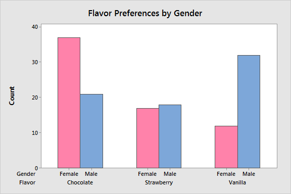
Clustered bar charts are when you have subcategories within the categories that you are measuring, such as favorite ice cream flavor by gender:
Stacked bar charts also show subcategories, but stacked on top of one another so as to emphasize the total numbers for each category, rather than for each subcategory:

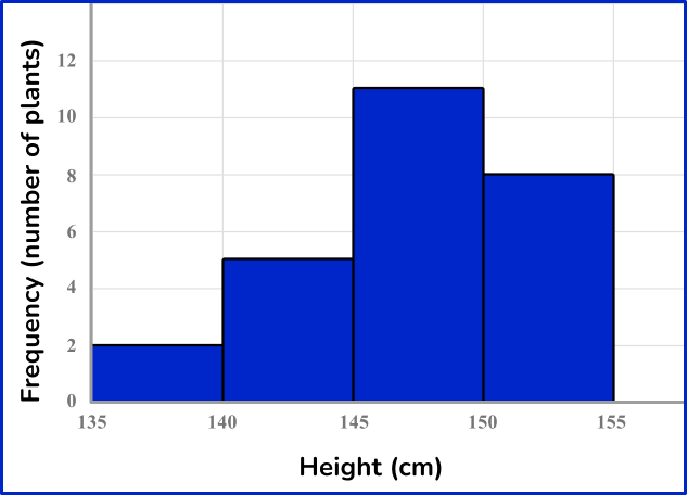
A histogram is like a bar chart, except instead of showing a list of items on one axis and numerical values on the other axis, a histogram shows a range of numbers along one axis and numerical values on the other axis. For instance, this histogram shows how many plants a garden has with each range of heights--between 135-140cm, 140-145cm, 145-150cm, and 150-155cm:
Yi, Mike. “A Complete Guide to Bar Charts.” Chartio, https://chartio.com/learn/charts/bar-chart-complete-guide/. Accessed 31 Jan. 2024.
In this video, librarian Brian Matzke demonstrates how to create a bar graph, histogram, and scatterplot in Microsoft Excel using a spreadsheet of data on the number of households in each state that owns cats or dogs.
 Better Data Visualizations: A Guide for Scholars, Researchers, and Wonks
by
Better Data Visualizations: A Guide for Scholars, Researchers, and Wonks
by
 A History of Data Visualization and Graphic Communication
by
A History of Data Visualization and Graphic Communication
by
Elihu Burritt Library
Central Connecticut State University, 1615 Stanley Street,
New Britain, CT 06050 - Map
CCSU Home | Central Pipeline | CentralSearch / Catalog | Sign In to CentralSearch | Search Library Website